Coca-Cola Group
‘One-Stop-Shop’ trade campaign: identity, image creation, print
click any image above to view in full
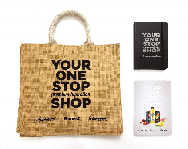
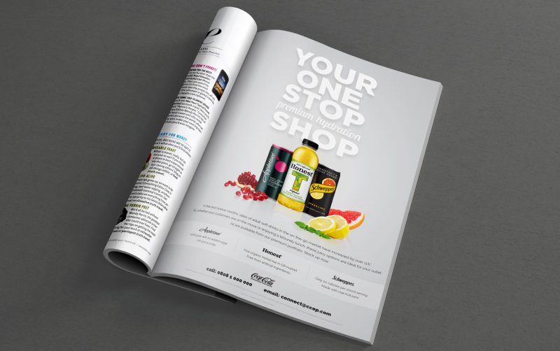
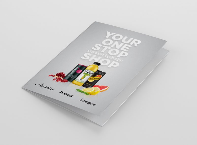
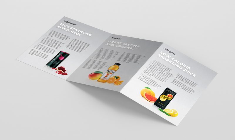
images (from top left): 1: Tote bag, notebook, and brochure give-aways. 2: Full-page trade press ad. 3 & 4: Printed brochure.
Through work for Appletiser, we were approached by the Coca-Cola Group to create a trade-focused campaign to push three of their ‘adult’ brands to higher-end retail stores. This was the first of its kind for Coca-Cola, as they had never cross-promoted their brands together like this before.
As such, I had a tricky balancing act to perform in order to create both a unique look, but also ensure that the end product fit equally into all three brand personalities. Part of the project was to create a strong, distinct typographic identity that could be used across different promotional assets, that worked with (without overshadowing) each of the brands.
The first stage of the campaign consisted of a series of trade magazine ads, an accompanying brochure, bags, notebooks and T-shirt designs to be handed out as give-aways.
One of the challenges of the project was not only in the creation of a strong, clean, yet fairly ‘unbranded’ look, but also that (perhaps surprisingly) each brand did not have high-quality packshot images available for us to use. I had to create CG renders for each and then add fruit (sourced from stock images) to be the visual theme that tied them together.


